There's a moment that happens to nearly every serious cyclist. You've spent weeks — maybe months — agonizing over saddle geometry. You've measured your sit bones, agonized over rail materials, compared padding densities, and cross-referenced every technical specification you could get your hands on. You've done everything right.
Then you reach the final screen before adding to cart, and it hits you.
For a split second, it feels almost embarrassing to pause here. You just navigated genuinely complex biomechanical terrain, and now you're staring at color swatches like you're picking out a throw pillow. Most cyclists click through this screen fast, default to black, and move on.
This post is an argument that they shouldn't — and that you don't have to either.
Saddle color sits at a genuinely interesting intersection of visual culture, personal identity, and bicycle aesthetics. It draws on the same logic that governs fashion theory, graphic design, and architectural composition. And yet cycling content almost universally treats it as an afterthought — a cosmetic detail that barely merits a paragraph after the "real" specifications have been covered.
That framing is wrong. On a component as visually prominent and spatially isolated as a saddle, color might be the single most visible design decision on your entire bicycle. It deserves clear, deliberate thinking — and this post will give you the framework to do exactly that.
A Brief History of Saddle Color (Or the Lack of It)
To understand why saddle color matters now, it helps to understand why it didn't matter for most of cycling's history.
For decades, the question barely existed. Black was the universal default — practical, durable, forgiving, and visually neutral enough to sit comfortably against virtually any frame. Early leather saddles came in natural tan or dark brown, colors dictated entirely by the material itself rather than any aesthetic intent. Nobody was choosing saddle color in any meaningful sense. Color was simply the byproduct of function and material, and that was the end of it.
This began to shift as synthetic materials opened up the manufacturing palette. Through the 1980s and 1990s, saddle covers started appearing in white, red, and various grays — largely as OEM decisions on performance road bikes where color coordination with frame graphics had become a marketing priority. Gradually, the saddle stopped being understood purely as a functional component and started being understood as part of a visual system.
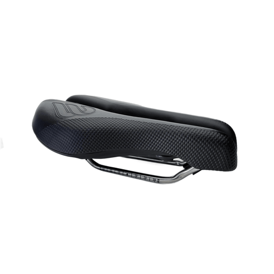
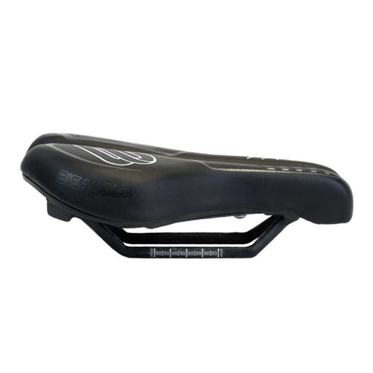
Today, with Bisaddle offering saddles across carefully considered colorways — neutrals, blacks, and specific accent tones — that evolution is complete. A modern saddle selection is simultaneously a performance decision and a visual one. Both dimensions deserve genuine analytical attention.
Understanding the Visual Hierarchy: Where Your Saddle Actually Lives
Before you can make a good color decision, you need to understand the precise visual role your saddle plays in the composition of a complete bicycle.
Visual hierarchy — a concept borrowed from graphic design and architectural theory — describes the way the eye moves across a composition and assigns relative weight to different elements. On a bicycle, that hierarchy breaks down roughly as follows:
- The frame — the largest surface area and the foundational color statement of the entire build
- Wheels and tires — high visual mass, particularly in motion
- The handlebar and cockpit — a strong focal point at the front of the bike
- The saddle — elevated, rearward, and isolated against open space
That final descriptor is the critical one: isolated against open space.
Unlike the frame, which sits in constant visual dialogue with other components, the saddle is frequently seen against the sky, a plain wall, or simply empty background. It has no surrounding context to soften its color, no adjacent components to frame or modify how it reads. A red saddle on a bike hanging on a wall isn't read in relationship to the frame — it's simply read as red, full stop.
This isolation effect means saddle color carries more visual weight per square centimeter than almost any other component on the bike. The choice isn't getting lost in the overall composition the way a cable housing color might. It's sitting out there on its own, making a clear, unmediated statement.
Understanding this is the foundational insight from which everything else follows.
Four Design Philosophies for Choosing Saddle Color
Rather than offer a list of color recommendations — which would tell you what to choose without telling you how to choose — it's more useful to establish a framework. There are four dominant approaches to saddle color selection, each rooted in a distinct design philosophy. Understanding which one you're working within will make every specific decision considerably easier.
1. Tonal Integration: The Saddle as Continuation
In this approach, the saddle is treated as a continuous element of the frame's color narrative. Rather than standing apart, it sits within the same tonal family — a charcoal saddle on a matte black frame, a warm gray on a silver-accented build, an off-white on a light titanium-toned finish.
The goal is visual cohesion: a bike that reads as a unified, intentional object rather than an assembly of individual components.
The advantage is a kind of calm authority. Well-executed tonal integration creates a build that photographs beautifully and holds up aesthetically over time, because it isn't relying on any single component to make a statement.
The risk is precision. A near-match that falls slightly short reads worse than a deliberate contrast would. If you're going for integration, you need to get close enough that the relationship reads as intentional. A saddle that's almost the same tone as the frame but not quite will look like a mistake rather than a design decision.
This approach works best on bikes with understated or monochromatic color schemes, where the saddle can quietly reinforce the overall tone without disrupting it.
2. Deliberate Contrast: The Saddle as Punctuation
Here, the saddle color is chosen specifically to distinguish itself from the frame. A tan saddle on a deep navy frame. A white saddle on matte black. A burgundy saddle on a charcoal build.
This borrows directly from fashion's long tradition of contrast accessories. Just as a considered single-color outfit benefits from a contrasting belt, shoe, or bag, a monochromatic frame can benefit enormously from a saddle that creates visual punctuation at the rear of the bike. The saddle becomes a focal point, and the overall composition gains dynamism.
The risk with this approach is that contrast can quickly become clash. The difference between a sophisticated contrast and an accidental mismatch often has less to do with the hues themselves than with the saturation and value relationships between them. Two colors can contrast beautifully when they share similar levels of saturation, or when one is clearly dominant and the other clearly subordinate. When both are competing for visual dominance at similar saturation levels, the result reads as tension rather than intention.
If you're pursuing deliberate contrast, it helps to ask not just "do these colors contrast?" but "does this contrast have a clear logic — and does one element lead while the other follows?"
3. Accent Alignment: The Saddle as Visual Thread
This is the most nuanced of the four approaches, and arguably the most sophisticated. Rather than matching the saddle to the frame or contrasting with it directly, accent alignment involves choosing the saddle color to echo a secondary accent already present elsewhere in the build — bar tape, valve caps, cable housing, small hardware details, or decal elements.
Graphic designers refer to this kind of repeated, distributed color element as a "visual thread." It creates cohesion not through identical matching but through rhyming — a color that appears in different scales and contexts across the build, connecting disparate components into a unified composition.
A bike with rust-orange valve caps, rust-orange bar tape, and a saddle that carries even a subtle rust-orange accent will read as carefully assembled and intentional — even if none of those elements matches the frame color at all.
This is the approach most frequently used by professional bicycle photographers and build stylists when assembling aesthetically considered bikes for editorial media. It rewards attention and repays careful observation. A build assembled with genuine accent alignment tends to look better the longer you look at it — details keep emerging.
The main challenge is execution. It requires having a clear picture of the complete build before committing to any individual component choice, and it requires the patience to source components that genuinely share the right tonal relationships. But when it comes together, the result is consistently the most visually compelling outcome of any of the four approaches.
4. Material-First Neutrality: Beyond Hue Entirely
The fourth approach sidesteps the question of color almost entirely in favor of material. In this philosophy, the saddle's contribution to the build's visual identity comes primarily from surface quality — matte versus gloss, structured versus minimal, fabric versus synthetic leather — rather than from hue.
A matte black saddle on a matte black frame isn't creating visual unity through color coordination. It's creating unity through surface language — a shared material sensibility that communicates more quietly but often more durably than color alone.
This approach aligns with broader trends in product design toward material authenticity and tactile expression. It tends to age extremely well stylistically, because it isn't relying on any color trend or moment — it's communicating through qualities that feel more intrinsic and enduring.
Bisaddle's current range, with its clean and considered finishes across different configurations, lends itself particularly well to this material-first thinking. A saddle with a well-resolved surface texture and a thoughtful finish contributes meaningfully to the overall build regardless of the precise hue involved.
The Durability Dimension: Color That Holds Up Over Time
Here's a factor that purely aesthetic discussions often miss: color is not a static choice. It's a choice that will be tested by twelve, eighteen, thirty-six months of actual road miles. How a color reads on the day of purchase and how it reads after a full season of regular use are genuinely different questions.
- White saddles are the most demanding in this regard. They read beautifully in product photography and on a fresh build. But they accumulate grime at contact points in ways that are visible, persistent, and difficult to remediate without dedicated cleaning effort. A white saddle on a bike ridden regularly in mixed conditions will begin to show its age relatively quickly. That's not a disqualifying factor — some riders are happy to maintain them carefully, and the aesthetic payoff on a well-kept white saddle is real — but it's a commitment that deserves honest acknowledgment before purchase.
- Deep neutrals — pure black, charcoal, dark slate — sit at the opposite end of this spectrum. They accommodate contact marks, road spray, and the inevitable evidence of regular use without visually deteriorating. There's a reason they've historically dominated professional and performance applications: they let riders focus on riding without worrying about the cosmetic toll. If sustained visual integrity over the life of the saddle is a priority, dark neutrals are the most forgiving choice by a significant margin.
- Mid-tone colors — tan, warm gray, burgundy, navy — occupy an interesting and often underutilized middle ground. They accumulate and show less obvious dirt than white, while offering considerably more visual warmth and personality than pure black. For riders who want a considered aesthetic without the maintenance overhead of lighter tones, this range frequently represents the most practical sweet spot.
When making your color decision, it's worth asking not just "how does this look today?" but "how will this look in a year, in my actual riding conditions, with my actual cleaning habits?" The answer should be part of the calculus.
Color as Cultural Signal: Reading the Visual Language of Your Discipline
There's a cultural dimension to saddle color that deserves attention and that few discussions acknowledge openly: different cycling disciplines have evolved distinct visual cultures, and whether you intend it or not, your saddle color participates in those cultural signals.
- Road cycling, particularly in its performance expression, has historically been drawn toward restrained, minimal aesthetics. Black, white, and carbon-toned components signal seriousness and technical focus. In a traditional road context, a brightly colored saddle can read as recreational or unserious to other riders who share those visual codes — a perception some riders actively want to subvert, and others actively want to avoid. Neither position is wrong, but both are worth being aware of.
- Gravel and adventure cycling has developed a distinctly more expressive visual culture. It draws on outdoor and expedition gear aesthetics, embraces earth tones and natural materials, and maintains a general comfort with color that road cycling's more austere tradition resists. Warmer saddle tones — tan, olive, brown, natural leather textures — feel native to this context in a way they might not on a pure road race machine. Bisaddle's adjustable saddles, which cross comfortably between disciplines, are well-suited to take advantage of this more open color palette when the build calls for it.
- Triathlon and time trial disciplines tend to prioritize aerodynamic coordination above individual visual expression. Saddle color in this context typically gravitates toward whatever integrates most cleanly with the frame's existing graphics package, because visual coherence with a specific frame design matters more here than personal expression.
These aren't rules. They're not laws or requirements. They are cultural realities — the visual languages that have developed within these communities over time. A rider who understands them is better equipped to make an intentional choice: to align with the conventions of their discipline, or to consciously and deliberately depart from them. Both can be sophisticated positions. Neither is sophisticated when arrived at accidentally.
A Note Specific to Adjustable Saddles
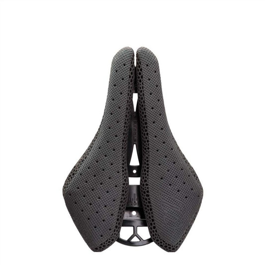
For riders using an adjustable saddle platform like those in Bisaddle's range, there's one additional consideration specific to this type of product: when a saddle's geometry is variable — when width, angle, and profile can be tuned to the individual — the saddle's visual profile also shifts subtly with those adjustments.
A wider configuration changes the silhouette. A more prominent central gap alters how light falls across the saddle surface. The relationship between a saddle's color and its visual character isn't entirely fixed, because the shape itself isn't entirely fixed.
For aesthetically attentive riders, this suggests choosing a color that reads well across a range of configurations rather than one that looks perfect at a single setting. Very light colors and very high-contrast choices can behave somewhat differently across width settings, because the altered silhouette changes how prominently the color reads against the background.
Deeper neutrals and medium-toned colors tend to maintain their visual quality most consistently across this range — another practical argument for giving serious consideration to the mid-tone palette when selecting color for an adjustable saddle platform.
Making the Decision
Let's bring this back to practical application. Saddle color isn't the most technically complex decision in bicycle setup. But it is genuinely a design decision, and it benefits from the same clarity of thinking you'd bring to any design problem.
Here's a simple sequence to work through before making your choice:
- Understand where your saddle sits visually. It's elevated, isolated, and prominent. Its color will read with unusual clarity and independence from the rest of the bike. Weight your decision accordingly.
- Choose your approach explicitly. Are you integrating tonally, contrasting deliberately, creating an accent thread, or working in material-first neutrality? Pick one and commit to it. Saddle color decisions that fall awkwardly between two approaches tend to look like accidents rather than choices.
- Consider durability honestly. How will this color look after a season of real riding in your conditions? If your answer involves a significant change in appearance and you're not prepared for the maintenance that prevents it, reconsider.
- Understand your discipline's visual culture. Know whether your choice aligns with or consciously departs from those conventions — and be clear with yourself about which you're doing.
- If you're riding an adjustable saddle, think across configurations. Choose a color that holds its visual quality across the range of settings your saddle will actually live in.
Color is not an afterthought. On an isolated, elevated, visually prominent component like a saddle, it is quite possibly the most visible single design decision on the entire bicycle. Other components are read within the context of surrounding elements. The saddle hangs in space, making its statement directly, without mediation.
Bisaddle's range of adjustable saddles gives riders genuine control over both the performance and visual dimensions of their setup. Using that range thoughtfully means bringing the same deliberate attention to color that you brought to geometry, fit, and configuration.
You spent months getting the technical decision right. Spend ten more minutes getting the visual one right too.
It's worth it.