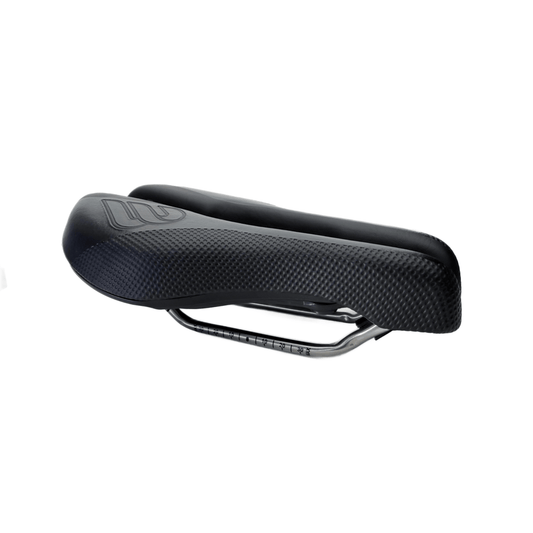
Most of us pick a saddle color the same way we pick socks for a ride: grab what matches, avoid anything too loud, and get on with it.
But a saddle isn’t a background detail. It sits high on the bike, lives in direct sun, gets rubbed thousands of times per ride, and collects exactly the kind of grit and sweat that turns “clean” into “why does this look old already?” faster than you’d think.
If you want your bike to look sharp and stay that way, saddle color deserves a little more respect. The good news: you can still choose based on style—you’ll just do it with a few real-world rules that keep the choice working long after the first photo.
Why saddle color behaves differently than other “style” choices
A saddle is a rare part where color can change your experience, not just the look. It’s exposed to sun when you stop, it’s a high-contact surface when you ride, and it’s one of the first things your eye lands on when you glance at the bike.
So instead of treating color as decoration, think of it as a decision that affects three practical outcomes: heat, how wear shows up, and how often it looks dirty.
Heat: the most overlooked consequence of saddle color
Dark colors generally absorb more solar radiation; light colors reflect more. That’s not controversial physics. What’s easy to miss is how quickly a saddle can heat up because it doesn’t have much material to buffer temperature changes.
And unlike a top tube, you don’t just touch a saddle with your fingertips. You sit on it—often after a stop when your skin is warm, your shorts are damp, and you’re least interested in a surprise “hot seat” moment.
When heat should influence your color choice
Color matters most if your rides include any of the following:
- Midday sun or hot climates
- Frequent stops (aid stations, cafés, photo breaks)
- Outdoor parking before or after rides
- Long gravel/adventure days where the bike leans in open sun
If that sounds like your routine, lighter or mid-tone colors can be a comfort win. If you mostly ride early, in cooler weather, or under tree cover, heat becomes less of a deciding factor and you can lean harder into aesthetics.
Color as a “wear map”: what it will look like after real miles
Saddles age. Even with careful use, the cover gets polished where you sit, scuffed at the edges, and stained by whatever your environment throws at it. The important question isn’t “will it wear?” It’s “how will the wear present itself?”
How common colors tend to age
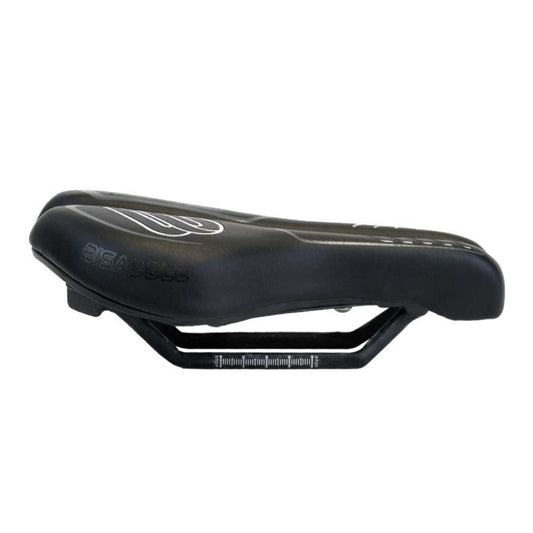
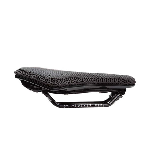
- Black: hides general grime well, but often shows glossing where friction polishes the surface. Once those shiny zones appear, they can look uneven even when the saddle is clean.
- White (or very light colors): looks crisp when fresh, but shows dirt transfer, splash marks, and staining quickly. It can stay beautiful—if you’re willing to maintain it.
- Mid-grey tones: usually the most forgiving middle ground. They don’t look dusty as quickly as black and don’t broadcast every smudge the way white can.
Why wear visibility can actually help you
This is the part most riders never consider: wear patterns are feedback. If you’re consistently scuffing one side more than the other, or if the edges are getting chewed up fast, it can point to fit and stability issues—like drifting, rocking, or excessive thigh rub.
A color that makes those signs visible early can save you discomfort later.
Match saddle color to your riding environment
Different disciplines have different “dirt profiles.” Even if you’re choosing purely for style, you’ll like your choice more if it matches what your saddle regularly encounters.
Road riding
Road grit is fine and sneaky. Sweat salt dries into pale residue. Drink mix spills happen. If you want the saddle to look consistent with minimal attention, darker or mid-tone colors are the easiest to live with.
Gravel and adventure riding
Gravel dust is relentless, and mud splash doesn’t care how expensive your kit is. A mid-tone saddle often stays looking “presentable” longer because it doesn’t show dust film as starkly as black or stains as harshly as white.
Indoor-heavy training blocks
If you ride indoors a lot, you tend to spend longer uninterrupted stretches seated. Hygiene and cleanup matter. Pick a color you’ll realistically wipe down—because the best-looking saddle is the one you actually keep clean.
Build aesthetics: “visual quiet” vs. “visual signal”
Here’s a simple way to avoid regret: decide whether you want your saddle to blend in or stand out.
Visual quiet (low contrast)
This is the cohesive, timeless approach: keep the saddle color close to the bike’s main tones. It photographs well, looks purpose-built, and stays consistent even if your kit changes through the year.
Visual signal (intentional contrast)
This is the deliberate accent approach: a light saddle on a dark bike (or vice versa). It can look exceptionally sharp—when it’s clean. The tradeoff is simple: contrast makes wear and grime more obvious, so you’re signing up for more maintenance.
A no-regret checklist for picking saddle color
If you want an easy decision that holds up over time, run through this list in order:
- Sun exposure: Will your bike sit in direct sun during stops or before rides? If yes, avoid the darkest colors if you’re heat-sensitive.
- Your terrain’s “dirt profile”: Dusty and dry? Mid-tones often look best. Muddy or wet? Dark colors hide stains longer.
- Your maintenance personality: If you don’t enjoy wiping gear down, choose a color that forgives neglect.
- Do you want wear feedback? Lighter and mid tones reveal contact patterns sooner; dark colors hide more until the wear becomes obvious.
- Quiet vs. signal: Decide whether cohesion or contrast is the goal, then commit to the upkeep that comes with it.
Where Bisaddle fits into a style-first choice
If you’re riding a Bisaddle, you’re already thinking a bit differently: adjustability invites refinement. Many riders go through a “dial-in” phase where they’re paying attention to stability, contact points, and whether their position stays consistent over long rides.
In that context, saddle color can support what you’re doing. A more revealing color can make contact and wear patterns easier to read while you tune the setup. A more forgiving color can keep the bike looking clean and consistent while you experiment.
Final thought: pick the color that keeps the look you want
Choosing saddle color for style is valid. The trick is picking a style that survives your actual riding—sun, sweat, dust, stops, and all.
Decide what matters most to you—cooler surface temps, low-maintenance cleanliness, graceful aging, or high-contrast impact—then choose the color that makes that outcome more likely. That’s how you end up with a saddle that still looks “right” after the miles, not just on day one.